Overview
I never thought that one day I would ever consider myself as a “designer.” Whenever I thought about “design” I thought about aesthetic features of an object, such as colors and material on clothing, or the shiny and sleek architecture of an iPhone. But ever since I started this course Human-Computer Interaction (HCI) everything about my perspective of design changed. I started to see design everywhere, because design isn’t just about aesthetics. Design has principles, processes, techniques, and its own philosophy. There is a clear line between good design and bad design. And design becomes more than its functions and abilities – we start to see the effect that it has, and the consequences that arise when certain aspects are overlooked.
During this semester I had a semester-long project with my classmates Landon and Chris, and created a prototype of something we call heART: a mobile platform that allows curators to connect with visitors and easily understand the vast amounts of data being collected (“heART makes data useful”). To best understand what we learned through readings and lectures, we applied the skills and methods of UX design to our own projects. This experience truly opened my eyes to the world of UX design, and why it is starting to become more of a necessity in any scientific and technological aspects. There are five main points I want to share that makes me believe that the world must run on good design:
- Designers should never assume what the users might want and apply these assumptions to their designs,
- Designers should not have to rely on the complexity of a design to accommodate users,
- Designers should always take into open arms critical feedback,
- Designers should consider all types of users, including those that have disabilities, and
- Designers should always keep in mind the Code of Ethics.
Let’s dive right in.
We are not the user.
If someone asked me, “What is one thing you’ve learned from the HCI course?” my answer would be this: we are not the user. This statement, in a designer’s perspective, is about how the designer should not assume what a user prefers or understands. A designer for doors, for instance, cannot just put a handle on it and assume a user would know whether to push or pull. Every single choice that a designer makes for a product should be clear and concise.
There were many instances where our group failed to consider this. One of them has to do with how we came up with this idea in the first place.
In our initial project proposal, we proposed that we wanted to develop sort of a “museum data enhancer” by not just putting in information about an artwork, but also how an audience reacted to the artwork, specifically emotional responses:
“Our vision is to create an application that will allow people to search for art based on emotions and feelings. Our current plan is to help people who are bad at being romantic or expressing their feelings, be better at it through artwork… We will deepen the existing museum database by adding user experiences.”
When our focus was shifted from an audience to an actual museum curator, we figured that they would find emotional responses of audiences to be the most useful data when, for example, deciding which exhibit to put up next. So we designed our questions for our contextual inquiries to be about emotional responses of an artwork. However, when we actually did our contextual inquiries, the curators claimed that
“…audience/visitor emotion is rarely a criterion for choosing a piece of art since it is so subjective that it is too difficult to use as a measure of art quality. However, she did say one of her goals was to find pieces that invoke intriguing ideas and unexpected discussion points. Therefore, if our design is to aid curators, emotion alone may not be the most helpful data for them.”
This made us realize that the data our product collects should not be, for instance, the word “happy” under a JSON property “audience response” in an artwork database. We needed to display information in unique ways that would help curators understand what about the artwork intrigued the audience.
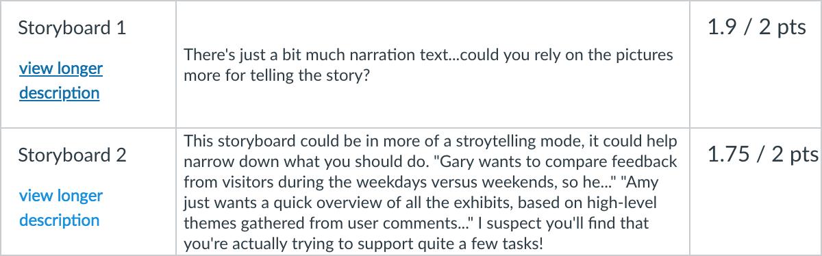
There were other instances when we realized that we are not the user. Our heuristic evaluations and usability testings with our first paper prototype gave us a lot of feedback on our design. This table is an overview of all the criticisms we received:
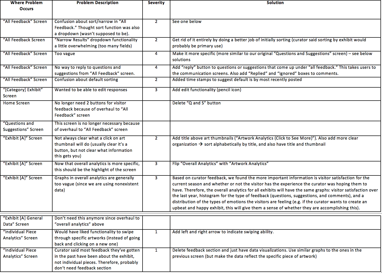
Everything from sorting and buttons, which we assumed the users would understand, to functions and displayed analytics, which we assumed users would want to see, were criticized as unclear or unnecessary. Most of the things we assumed about the user were wrong! And that’s the takeaway. Designers think differently about a product they are designing than users that actually use the product. Users don’t have a mind like the designers because they have not thought about generating the idea of the product or have been part of the process of making it – their only jobs are to use it. I found it personally useful to have a test user be involved in the design process, a UX method called “Participatory Design”: one of our testers, an art history professor, suggested key elements to our design that clarified a lot of things, such as what and how data should be displayed and visualized.
Keep it simple but functional.
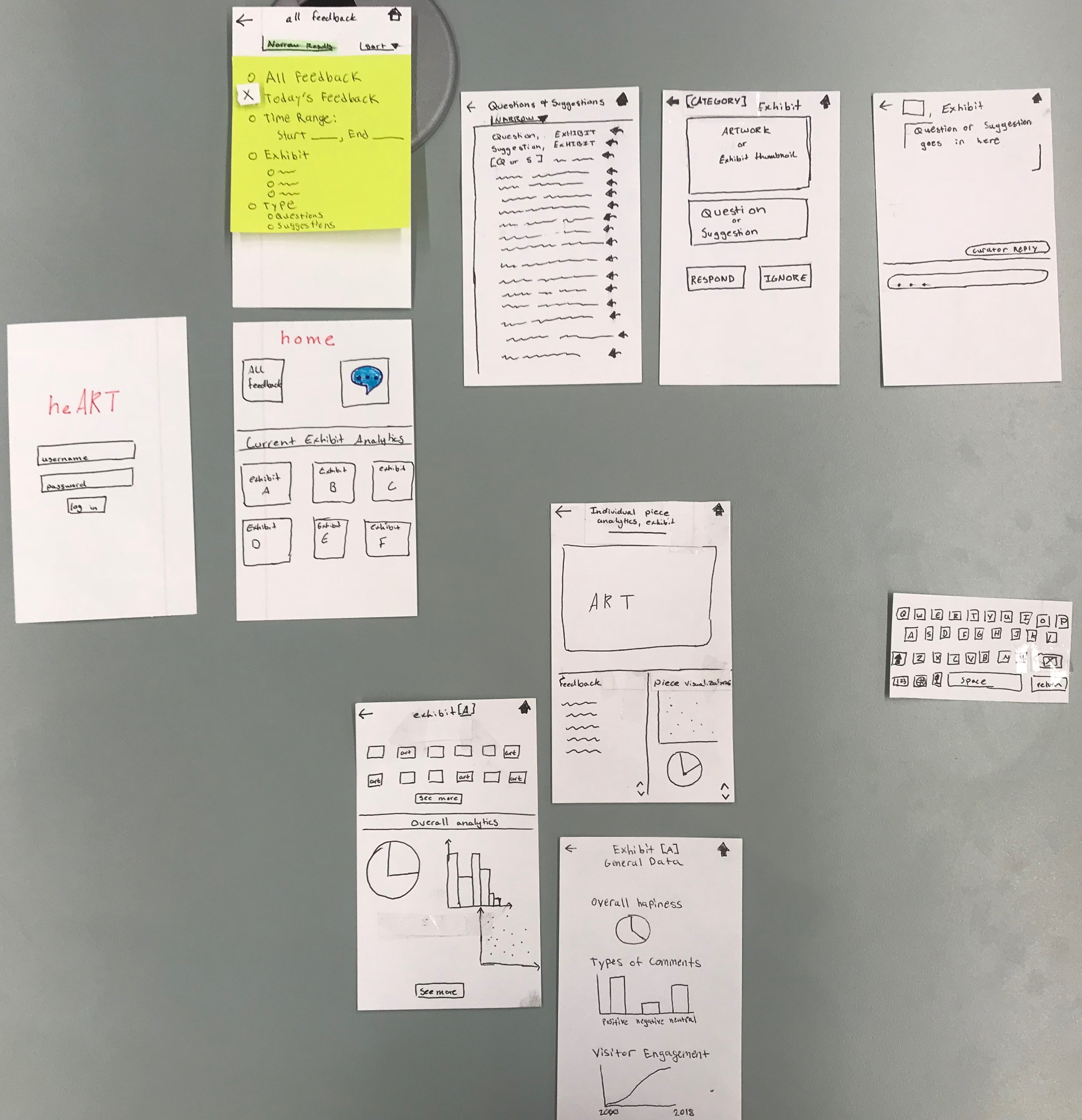
What is the difference between our first official paper prototype:
and our last one?:
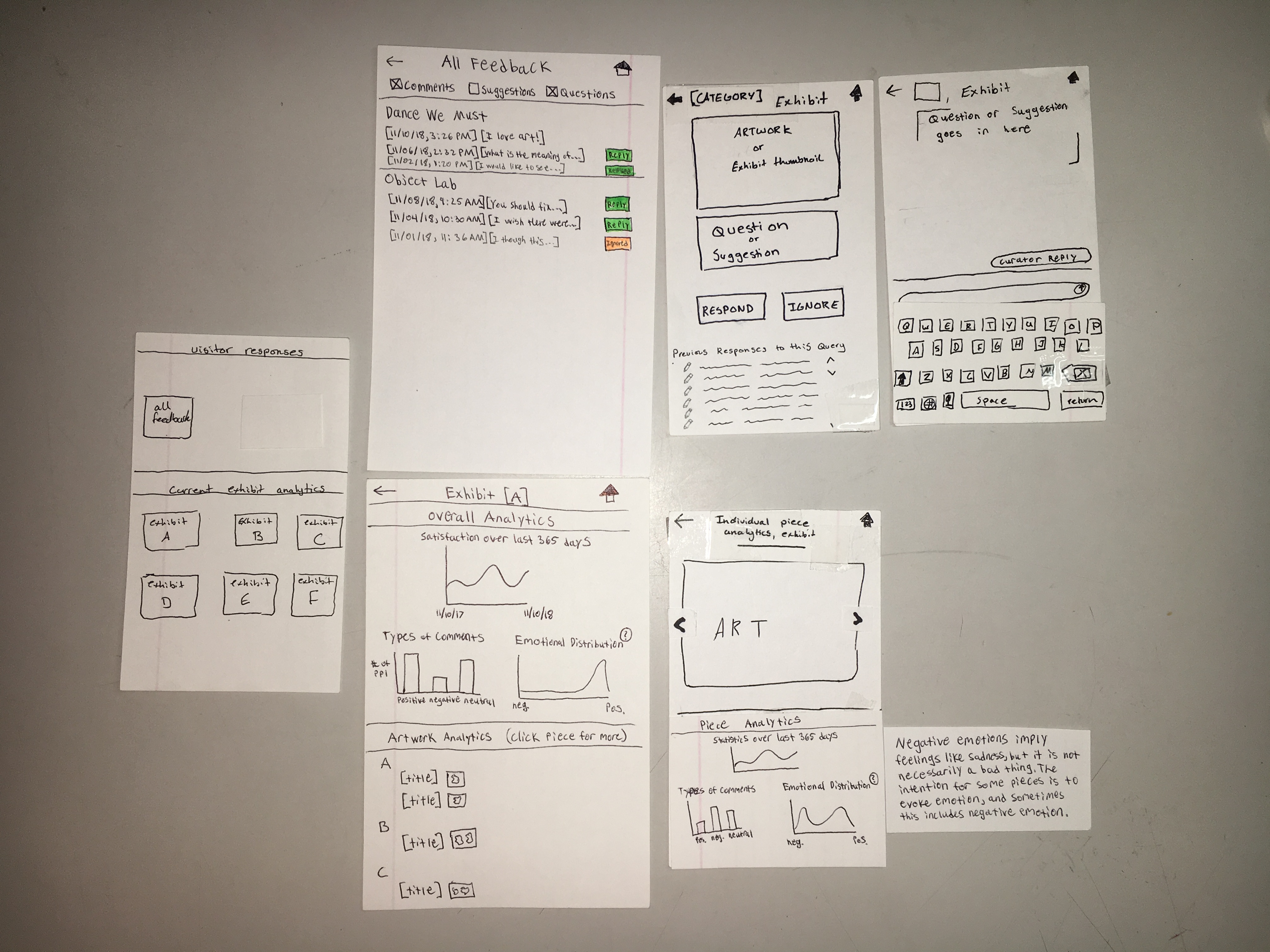
The answer: the number of screens decreased by 33%. We had nine screens in the beginning, and ended with six of them.
Why did this happen? The most obvious answer is that we, the designers, overthought about what the users preferred (relating to my first point above) and how we should accommodate the user so that one can have the most comfortable time possible when using our product.
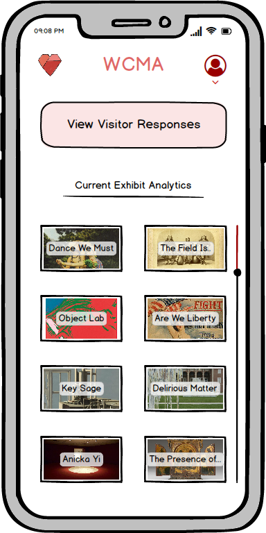
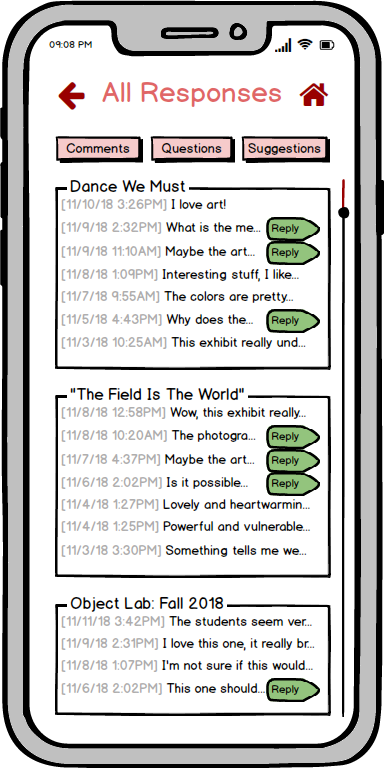
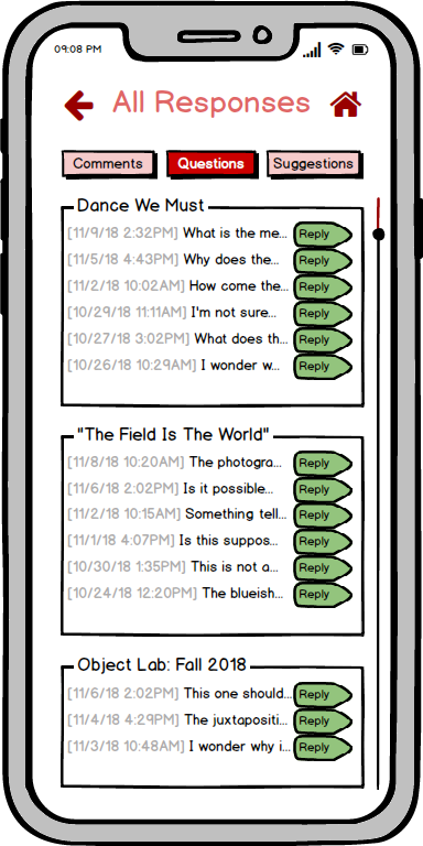
Our home page initially had an “All feedback” button, a “Questions and Suggestions” button, and a “Comments” section. Our thought process behind this was that this would allow the users to clearly distinguish the different types of feedback. After our usability and heuristic evaluations, we decided that we could just put everything into the “All feedback” section and have “Questions,” “Suggestions,” and “Comments” buttons for the user to filter the different types of feedback. This is reflected in our digital mockup, as we have just one button for “View Visitor Responses” in the home page, and buttons for different types of responses on the responses page. The last page shows only questions because the user pressed on the “Questions” filtering button:
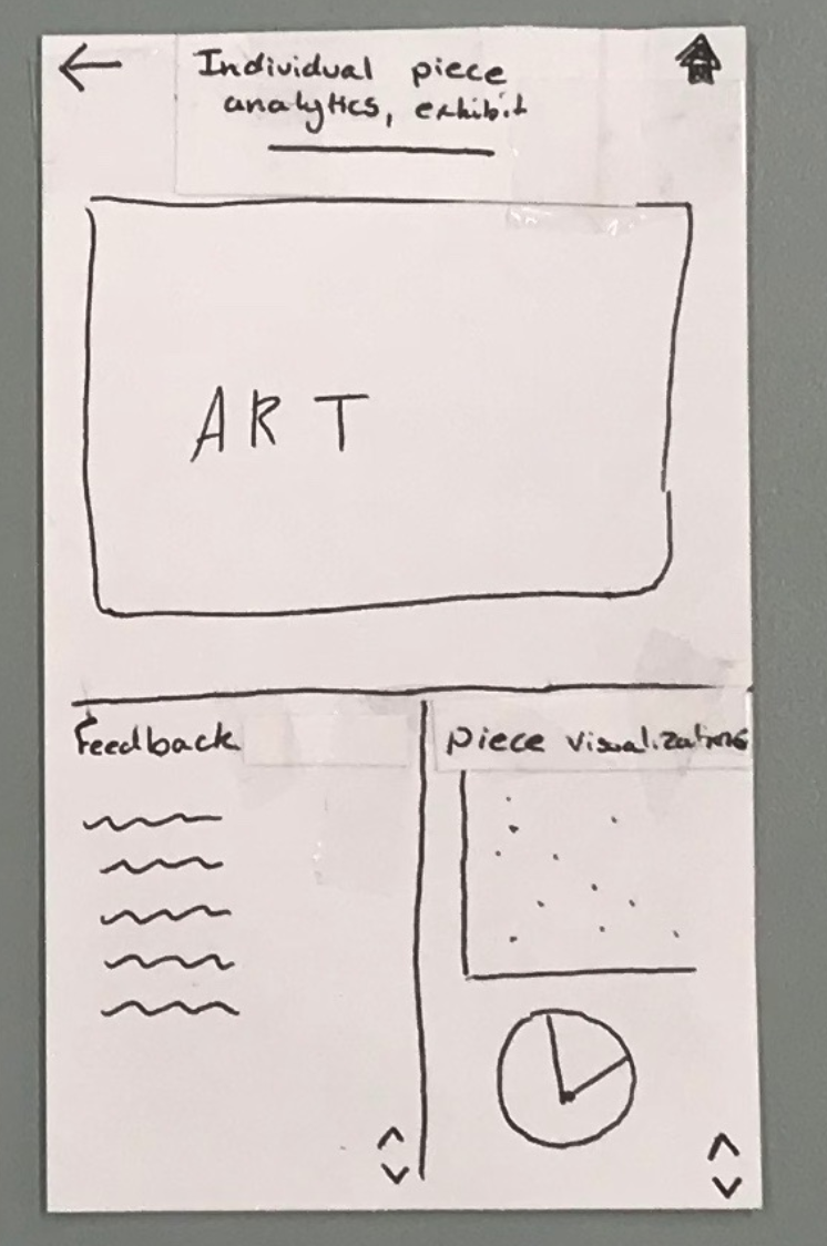
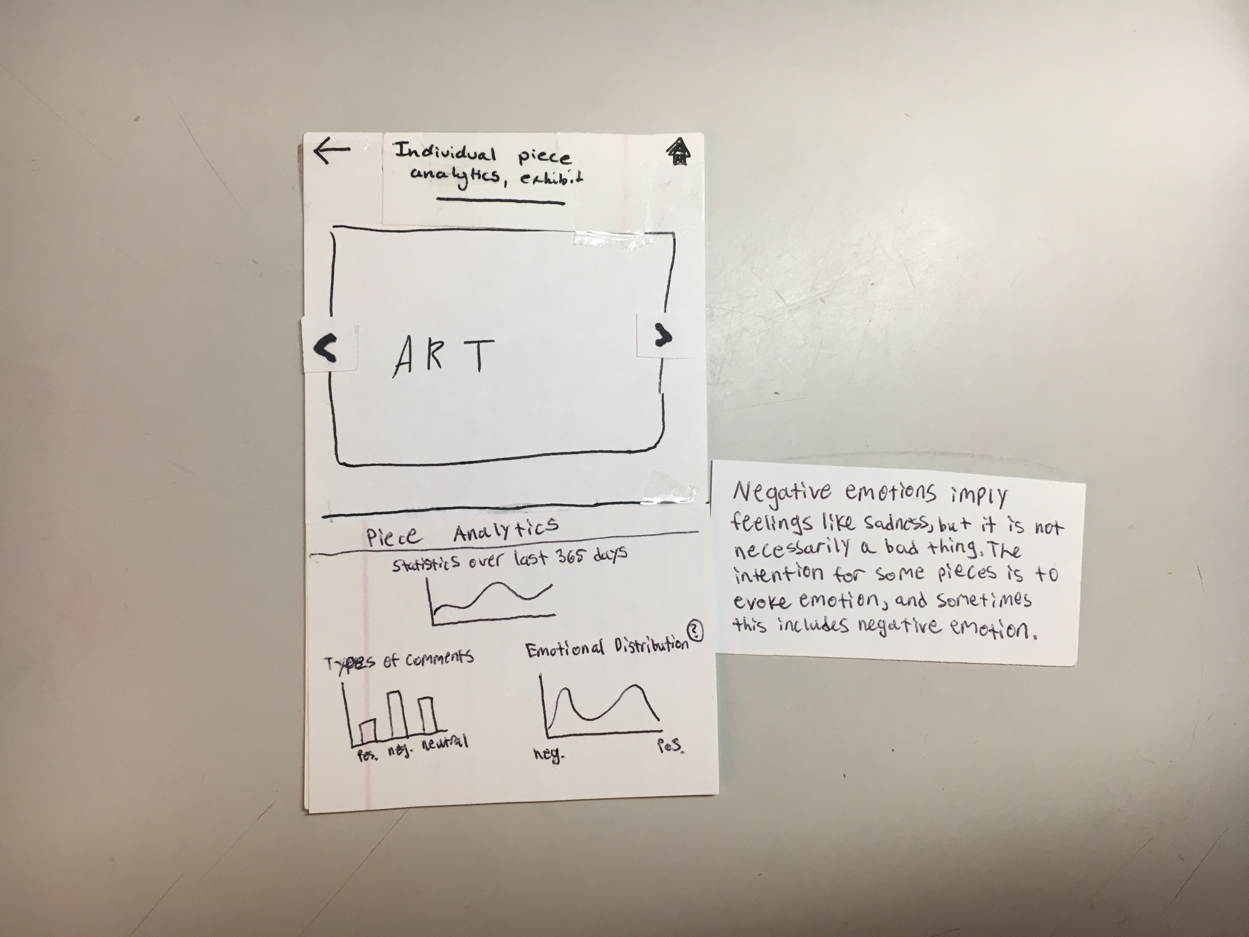
Another example that show how we complicated functions is how we first had a “feedback” section under each artwork page. This is because we thought it would be nice for the users to have the feedback section as a reference when looking at the data visualizations displyed in the artwork page. However, after some feedback from the usability testings, we realized it became best to just keep the feedbacks and data visualizations of an artwork separate (the first picture is our original prototype; the second is our edited version):
Overall, we went through a lot of modifications to have our product be simple enough to use, but still be able to perform the same tasks we based our original designs on. We cut everything short. We got rid of a lot of screens. We made the layout simple. We displayed concise, specific information. This resulted in a clean, efficient, and tight-knit product with simple, intuitive functions that provided a lot of information. Similar to the first point, designers shouldn’t assume that the users need more help than they actually need – users understand intuitive actions, and if we provide the necessary steps, both sides will be happy.
Don’t be afraid of feedback – welcome it.
This concept is not new to me. I’ve always believed that feedback is one of the most important factors when improving something, whether if it’s a skill or a product. And not surprisingly, feedback is extremely useful in designing because designers can know what they did right and what they can fix. This is why we have usability testings and heuristic evaluations, and other tons of UX methods to help us understand how a user will interact with our designs: it gives us information about what we did right and what we did wrong.
When talking about my weaknesses before our groups were decided, I mentioned that I was afraid of receiving feedback – not because I didn’t appreciate feedback, but because I did not want to waste any time fixing things over and over again. This is obviously the wrong approach, and I’ll explain why.
There was an instance in our designing process where I realized that there is no way you can ever avoid feedback. Being the artistic director of our group, I was in charge of drawing the storyboards based on our two tasks we have decided to pursue. Other groups’ storyboards are nice and simple, and fairly quick and easy to read. I, on the other hand, went extra top-notch:
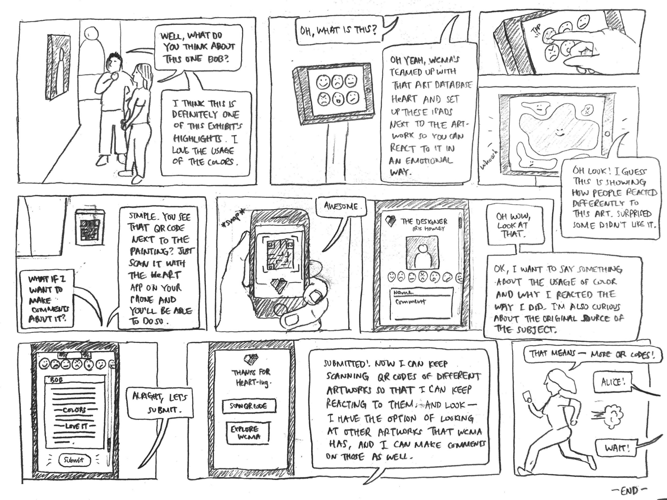
The reason is not only because I was feeling artistically ambitious, but also because I didn’t want to have the burden of fixing things after receiving feedback. Essentially, I wanted to get everything done at once instead of taking steps. But I underestimated the fact that it was possible I was already a lot of things wrong when I was designing these storyboards. Not only that, I also wasted a lot of time on something that could have been done a lot faster. The feedback I received from our professor Iris Howley proves this case:
Funny how even though I made an effort to not receive a lot of negative feedback, I still got negative feedback anyway!
A lot of the feedbacks that we received and we worked on are already mentioned in the previous points – and all of these feedbacks led to an effective design. Even suggestive feedback can be extremely helpful. For instance, after our task review, Iris suggested something that would shift our focus from collecting visitor data to displaying useful data for museum curators:
“I would consider dropping this task in favor of doing a deeper dive into the previous task and different kinds of questions/tasks that could be supported through presenting data. You can pretend you already have this data (it’s essentially a form submission, which is also why it is less interesting), and figure out what kind of information curators would look for.”
This is why designers should not be afraid of feedback, and accept them with open arms. Any sort of feedback can help designers understand what works and what doesn’t work in their designs, and therefore, inevitably result in even better designs. Designers must understand that nothing can ever be perfect for the first few tries – and even after multiple tries. Mistakes always come up, and it is always better to address the issue rather than ignore them.
Make it accessible – for all types of users.
How can we have our designs be accessible for everyone? It’s a little hard to accept that fact that, especially for complicated applications like heART, we as designers will have a hard time trying to accommodate everyone. Think about people with disabilities such as mobility issues, dyslexia, color blindness, low vision, deafness, etc. How will they be able to use our products if our products’ designs don’t “include” them? This is where the POUR methodology comes in handy, as described by Andrew Smyk in his article “Design With Accessibility in Mind: The POUR Methodology”:
- Perceivable: How will content be interpreted or processed by the user? How is the content being presented and how can it be delivered to the user?
- Operable: What type of input methods are available for the user to use and control? What type of affordances or cues are you giving the user?
- Understandable: Can users derive the meaning of content or how it is used? And finally,
- Robust: How backward compatible is your code base? Are you using up-to-date technologies that are not supported by older browsers?
This methodology allows people to be at the center of process. Us designers have to accommodate to the needs of our target audience – and this includes those with disabilities. The UK Government has designed several Do’s and Don’ts on designing for accessibility that is a great reference design tool.
How did heART focus on inclusive design? We chose very simple colors: colors of red, pink, and white, so that color blind users can differentiate the shades of the colors and understand what aspects of the design represent what:
Buttons are at reachable positions: our back and home buttons are located in the top corners of the screen, and our “reply” buttons in our responses page are all placed in the side so that it is easy to reach for those with mobility issues:
And lastly, all of our artworks, exhibits, buttons, and information are properly and concisely labeled for users with screen readers:
It’s extremely important that designers try to accommodate for not just regular users, but those with any sort of disabilities. We don’t want users to feel discouraged when using our product – we want them to feel included. A good designer always should have this in mind when designing something, for users with disabilities have every right to use a product in the most comfortable and accessible ways.
Thanks for bearing with me. On to the last and the most important point…
Everything has an ethical consequence.
Accessibility is not just another aspect that designers need to consider – it is the right thing to do. And this is why ethics is possibly one of the most significant aspects of HCI. If designers are not careful enough, and do not consider certain perspectives while creating and testing their products, there is a moral consequence that affects users. Any aspect of design can have a significant impact on people’s lives and well-being. And there are plenty of examples in the technological world that demonstrates these impacts.
There are two Code of Ethics that are extremely important to keep in mind when designing anything: the ACM Code of Ethics and Professional Conduct, created by the Association for Computing Machinery (ACM), and the Signal Code, provided by the Harvard Humanitarian Initiative. Both codes are based on the understanding that the public good is always the primary consideration.
Following these two codes, our group realized some of our own ethical guidelines during the course of this project. Although we focused more on the visualization of data rather than the collection of it, we still feel that there were still important ethical factors that we had to take into consideration.
-
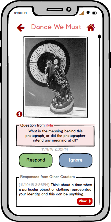
Privacy and protection of personal data. Although heART is an application dedicated to data visualization, the way the app functions is through user interaction. This means that the data that is visualized relies on the responses that audiences give about art. We make sure that the responses that the users give about an artwork stay either anonymous or rely on a first-name basis. For example, when users give in responses for the curators to read, the responses are identified only by their first names (in the digital mockup, we can only see “Kyle” and not “Kyle Lastname”):
Also, users would have to log in with a username and password – although this is not explicit in our final design, we made sure that securing personal and private data was one of our considerations taken long ago. Contextual inquiries and usability tests were also anonymous as we stated, as they are referred to as User Testing 1, 2, or 3.
-
Giving credit for the intellectual property of others. In our digital mockup, the only original image is our logo; every other image has been pulled from either WCMA’s website or have been taken from the actual WCMA. Therefore, to ensure that every image of an artwork is associated with a WCMA exhibit or the creator of that artwork, we have put their information in every artwork page (such as title, artist, description, date, types of material, size, etc.). Take a look at this example, where the info about the photo is under the image:
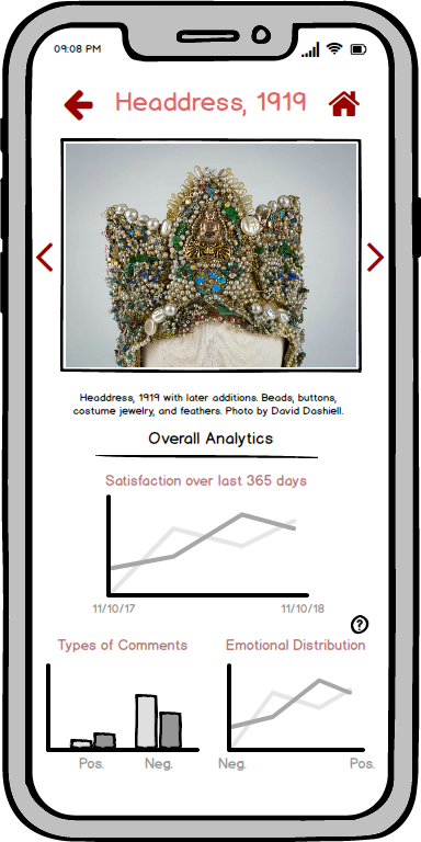
It is important to include relevant citations and sources for people’s content, even in an application dedicated to art in a museum! We must always respect people’s work (and also abide by the law, as a side note).
-
The right to oversee the use of their data. Although this is also not explicited stated in our application, this is an ethical right that we have taken into consideration while creating our design. It applies to heART because a lot of the artwork responses that users give will be processed into data relevant to the art. For example, since “Kyle” asked a question about an artwork, when a curator takes a look at the artwork’s analytics, which includes emotional responses and types of comments, Kyle’s comment that illustrates his confusion will be in the data. Therefore, every time a user responds to an artwork, there will be a note saying that their comment will be in the artwork’s database and a form of the comment will be reflected in that data. Users would also receive a notification whenever a curator responds to their questions or suggestions.
Designers should always have their own ethical guidelines, along with the Code of Ethics and The Signal Code, constantly reminded while working on their products. They should always be cognizant of how much their design will impact their users: the consequences of bad design may affect someone’s health and well-being.
Conclusion
There you have it – a summary of all the important things I’ve learned through this HCI course. The takeaways that I’ve perceived apply to any sort of design processes in the world, way beyond the mobile application that Landon, Chris, and I built. A good design doesn’t just appear out of nowhere: there must be constant testing, multiple revisions from feedbacks, continuous awareness of the aftermaths of certain design aspects, and efforts to make a design simple and accessible for anyone to use. A good design, therefore, isn’t just proper functions or pretty appearances. It is inclusion of every type of user, and a design that is avoids any sort of harm onto the public.